Ready the trumpet fanfare!
The Pantone Colour of the Year for 2024 is: Dah Dah Dah TaDaaahh.
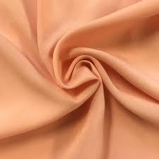
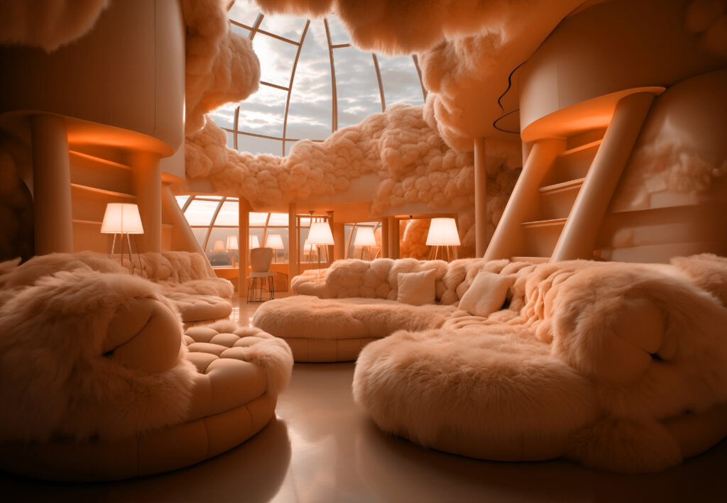
PEACH FUZZ. Yep, Peach Fuzz it is. Pantone 13—1023
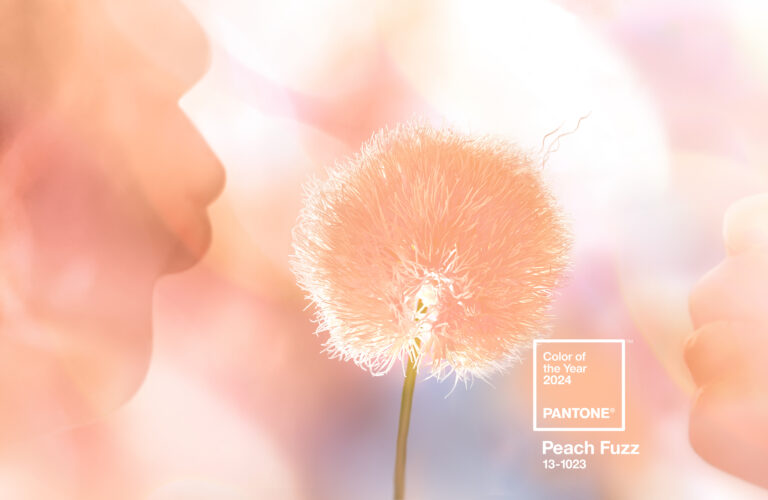
“In seeking a hue that echoes our innate yearning for closeness and connection, we chose a colour radiant with warmth and modern elegance. A shade that resonates with compassion, offers a tactile embrace, and effortlessly bridges the youthful with the timeless.” That’s from Leatrice Eiseman, executive director, Pantone Colour Institute™
Peach Fuzz, claims the Pantone website, “captures our desire to nurture ourselves and others. It’s a velvety gentle peach tone whose all-embracing spirit enriches mind, body, and soul.”
While Pantone may be THE Colour of the Year, there are others.
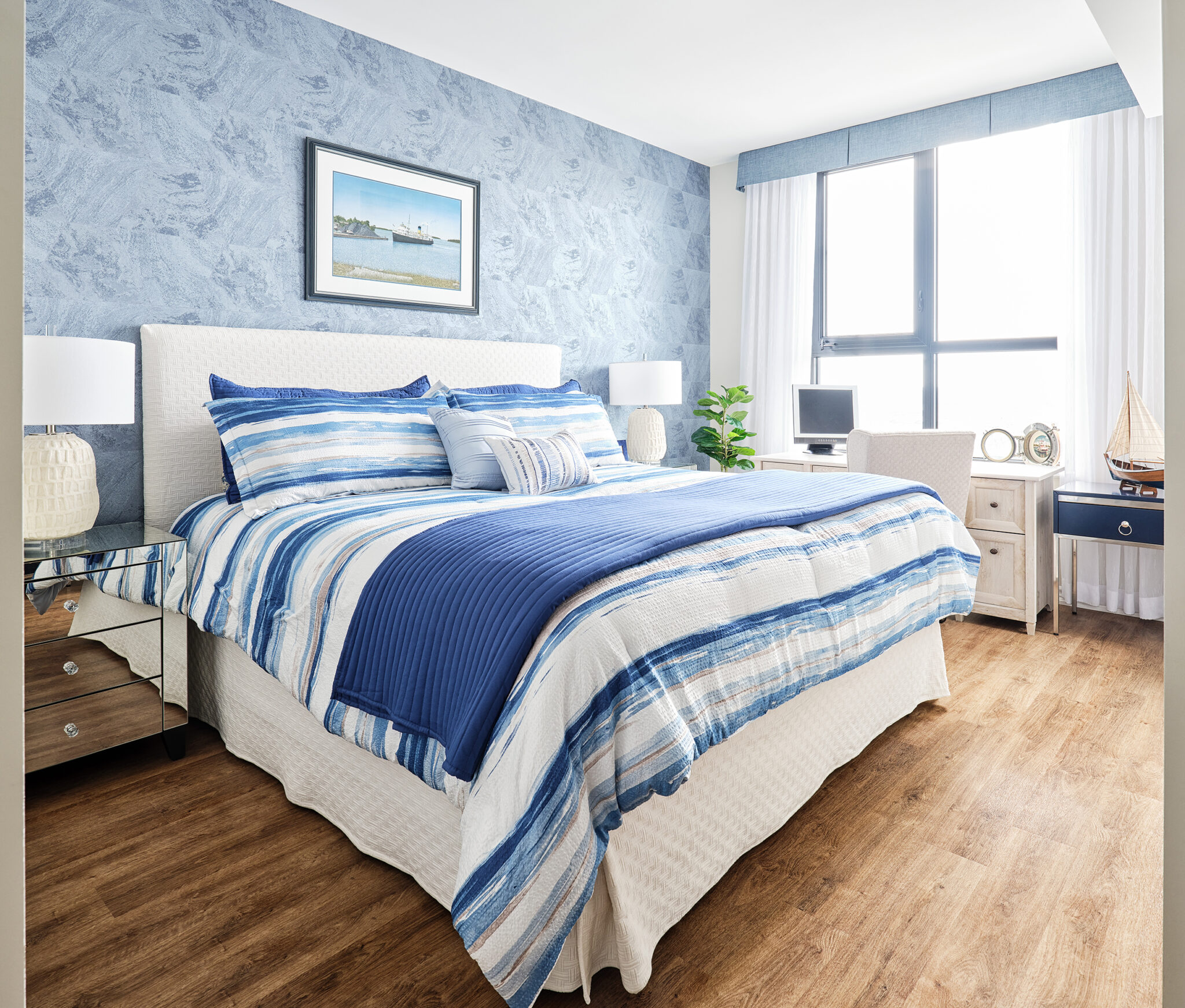
Our LIVV Home Furnishings Collection™ partner Benjamin Moore has proclaimed Blue Nova has its 2024 Colour of the Year, described as “violet and blue coming together in the elevated, sumptuous hue.”
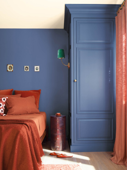
Blue Nova by Benjamin Moore
Adding to the kaleidoscope are: Persimmon by HGTV Home by Sherwin-Williams; Ironside by Dutch Boy; Cracked Pepper by Behr; Renew Blue by Valspar, and Limitless by Glidden.
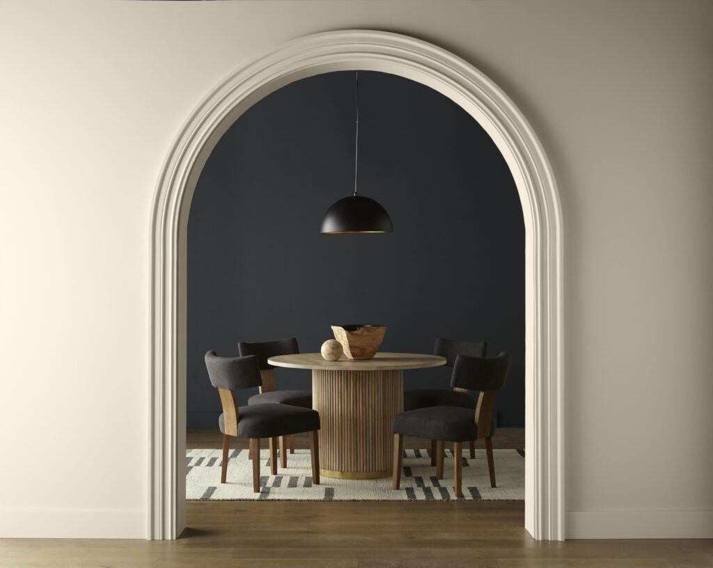
Cracked Pepper by Behr
How did all this start anyway?
Voila! We found an article at ArchitecturalDigest.com titled Here’s How Colour of the Year Mania Came to Be.
“In the 1957 romantic comedy Funny Face, Kay Thompson—playing a larger-than-life fashion editor inspired by Diana Vreeland–leads a musical number in which she marshals her staff (and presumably the world at large) to “think pink!” Bolts of Pepto Bismol–coloured fabric unfurl across her carpeted office floor as she tells her junior editors to “bury the beige.” As it turns out, Funny Face was right on schedule. In real life, pink was all the rage, dousing everything from a 1957 Ford Thunderbird to a 1957 RCA Whirlpool electric range. The parallel underscored a uniquely 20th-century phenomenon—that colours themselves could have moments.”
Isn’t that funny since this is still the season of Barbie pink?
More from that article: “It can be tempting to think of colour trends mere whim, or—when a trend really takes off—as a lucky stroke of creative genius. But as that other esteemed fictional fashion editor, Miranda Priestly in The Devil Wears Prada, famously
schooled her hapless assistant Andy, the colours of consumer products are never an accident. They are deliberately chosen, work their way through retail networks high and low, and end up tinting the wardrobes of even those who claim to be indifferent to fashion.”
The Pantone Colour System has been the standard for colour matching since 1963. In 1999, the Pantone Colour Institute created the Pantone Colour of the Year educational program to engage the design community and colour enthusiasts around the world in a conversation around colour. The Pantone website states: “We wanted to draw attention to the relationship between culture and colour. We wanted to highlight to our audience how what is taking place in our global culture is expressed and reflected through the language of colour. This thought process rings just as true today as it did back in 1999. That’s one of the major reasons why, each year, so many around the world look forward to our Pantone Colour of the Year announcement.’
Pantone may not have been the first, though. Pratt & Lambert, a paint manufacturer geared to the interior-designer market, claims their program dates to 1996
In any case, how does all this help the consumer?
First, it does stimulate some fun conversation and debate, even if it’s only about: How in the world do they come up with those names?
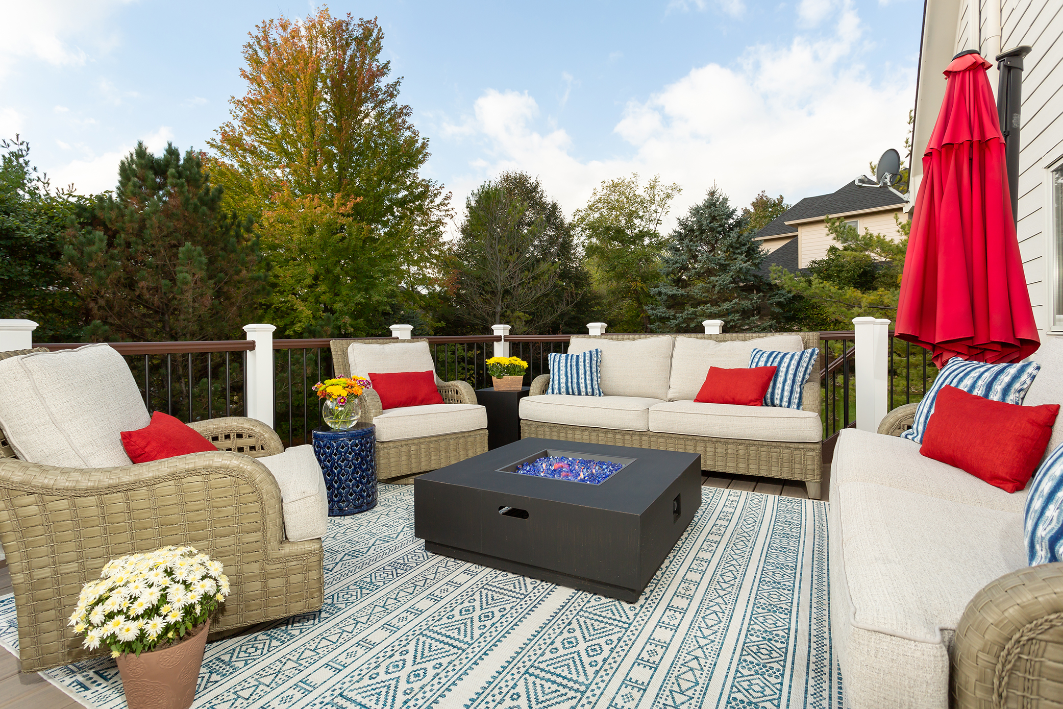
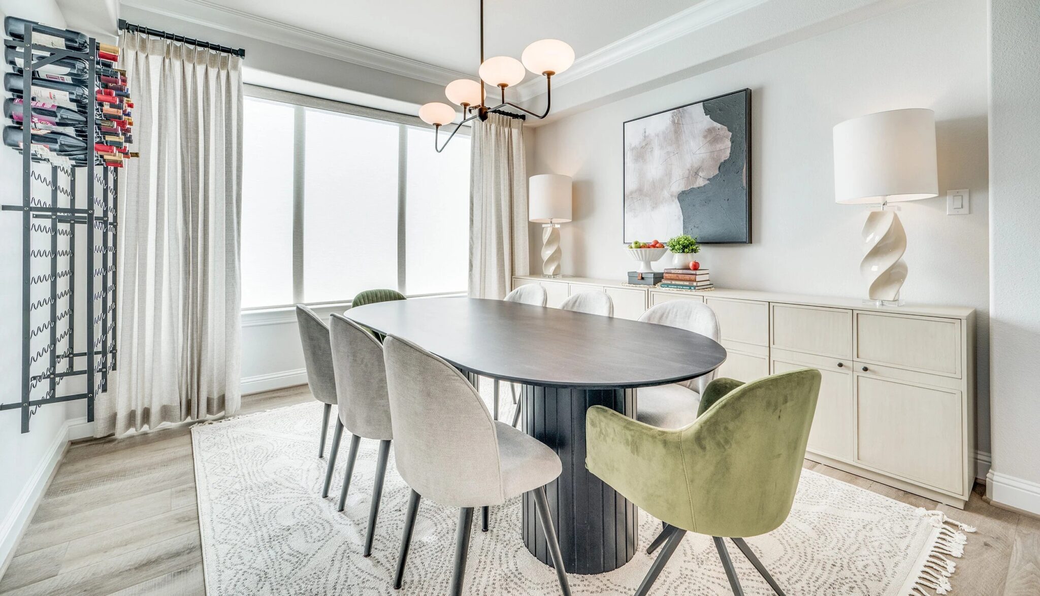
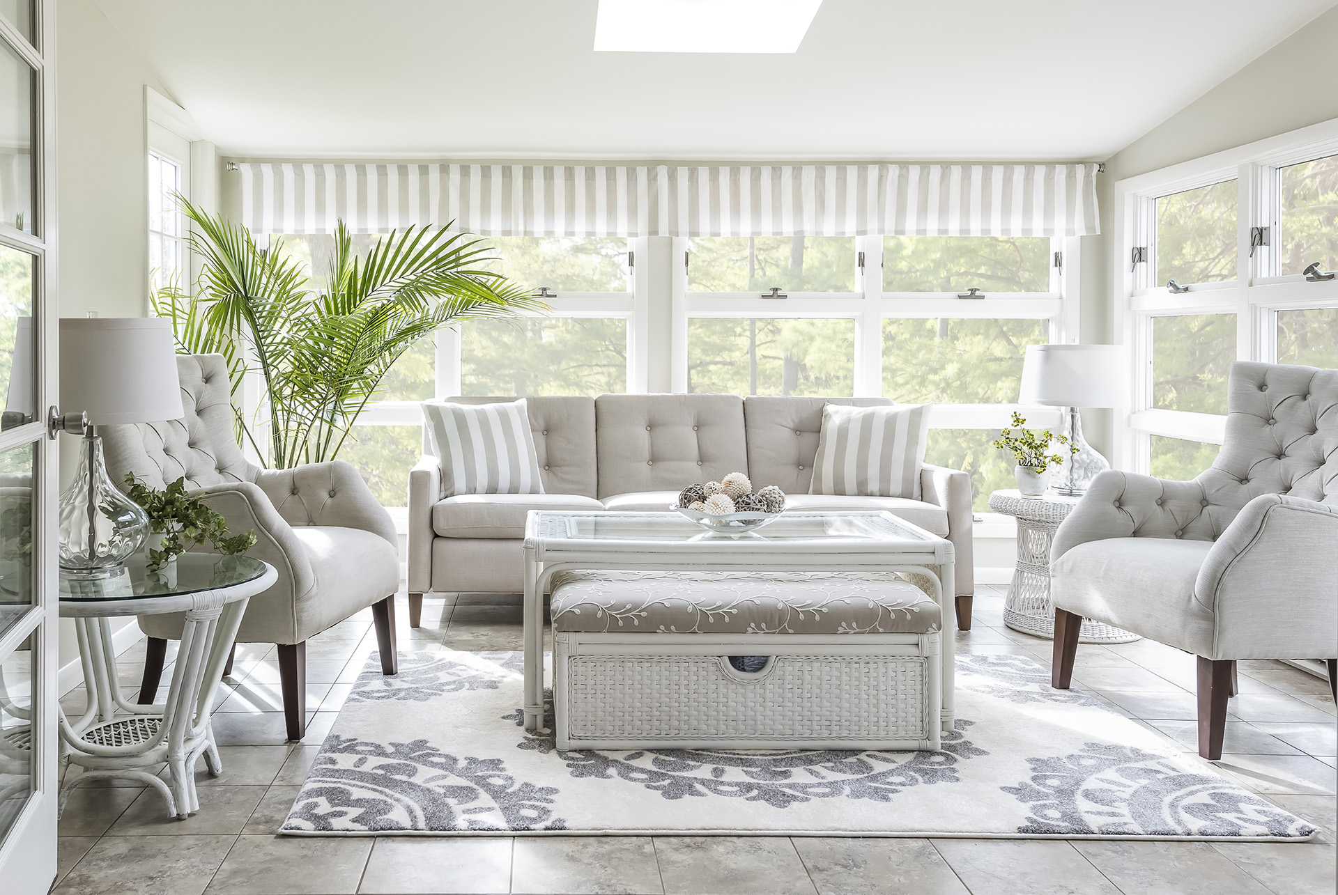
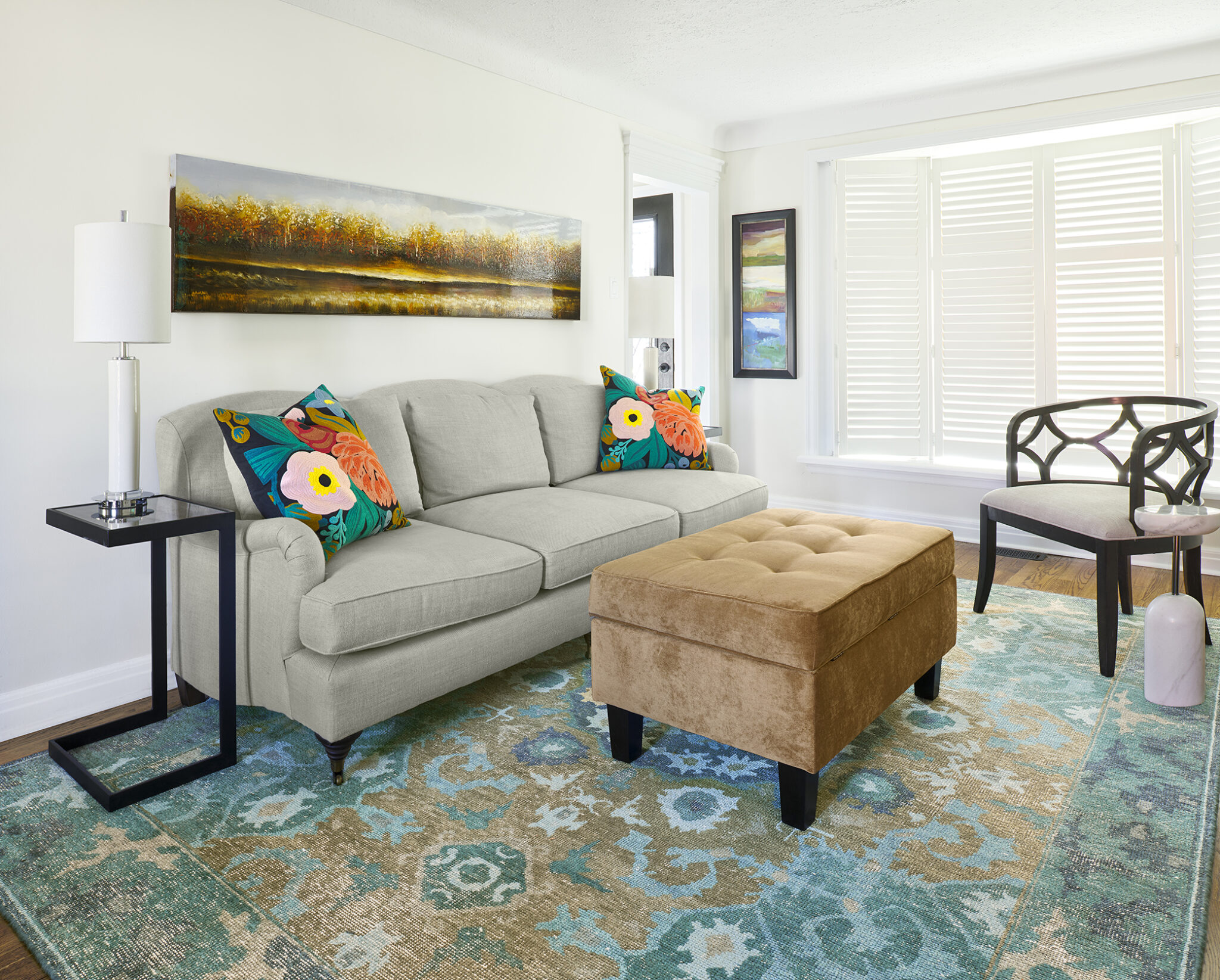
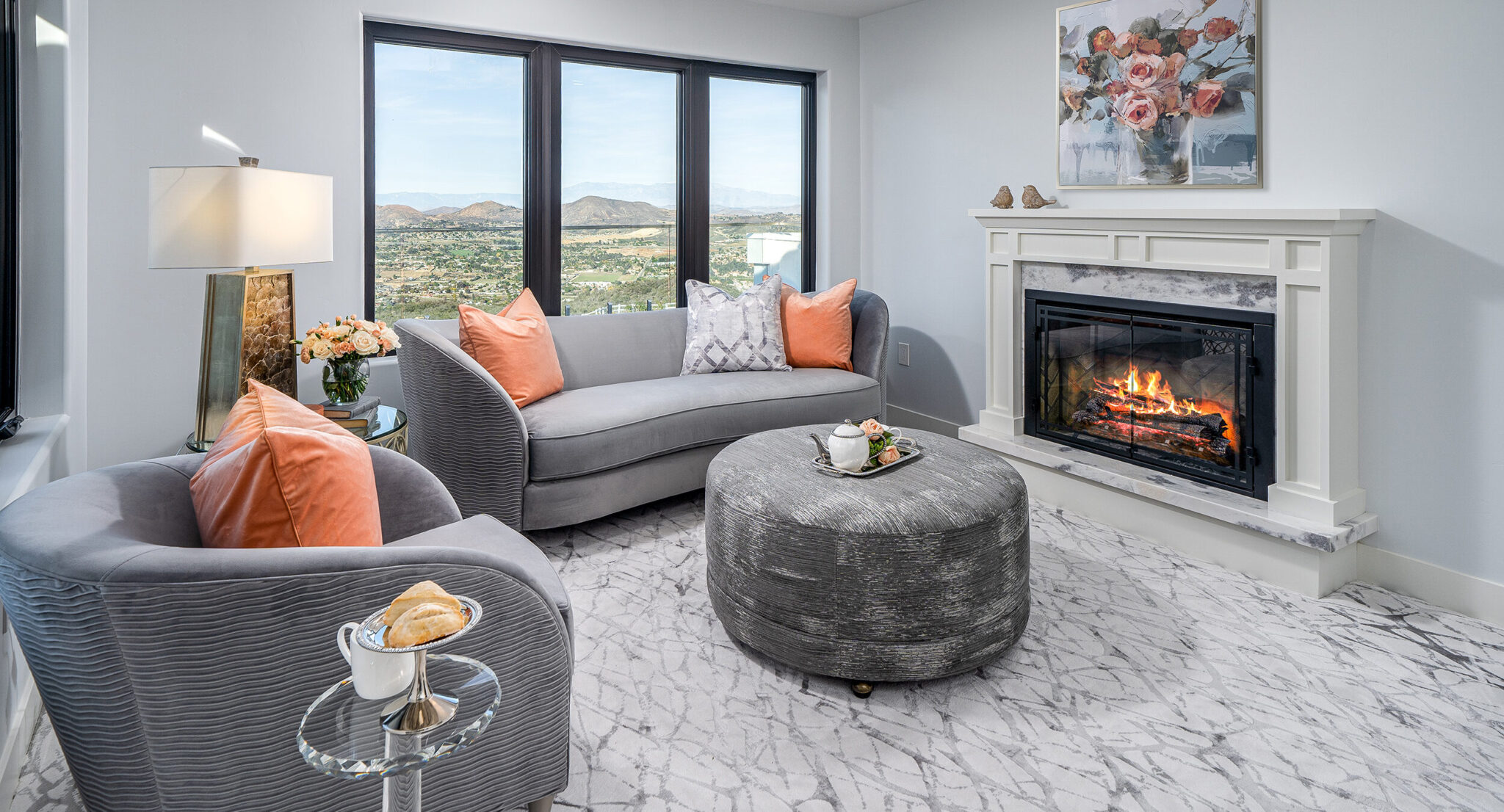
Second, it fosters creativity. Most of us don’t want to be boring with our interiors. Colours of the year make us think beyond the basic red, blue, yellow, green, or black and white, or even beige.
Third, it helps us learn more paint brand names. Although I’m not sure how important that is.
Colour plays an important role in how interior decorating affects mental health. Colour moves us. Colour can set a mood and create a conversation. The website colourpsychology.org puts it this way: “It can excite or soothe your mood, raise or lower your blood pressure, even whet your appetite! Whether it’s innate or learned, it’s undeniable that colour has a vital impact on how we go about our lives.”
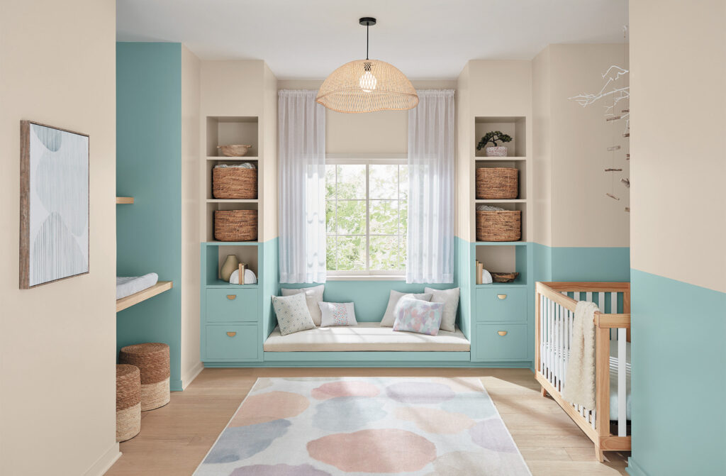
Renew Blue by Valspar
So take your pick and make 2024 more colourful. And if you need help figuring out how to incorporate these colours into your home, reach out to us at Ritu Brar Designs – Decorating Den Interiors.